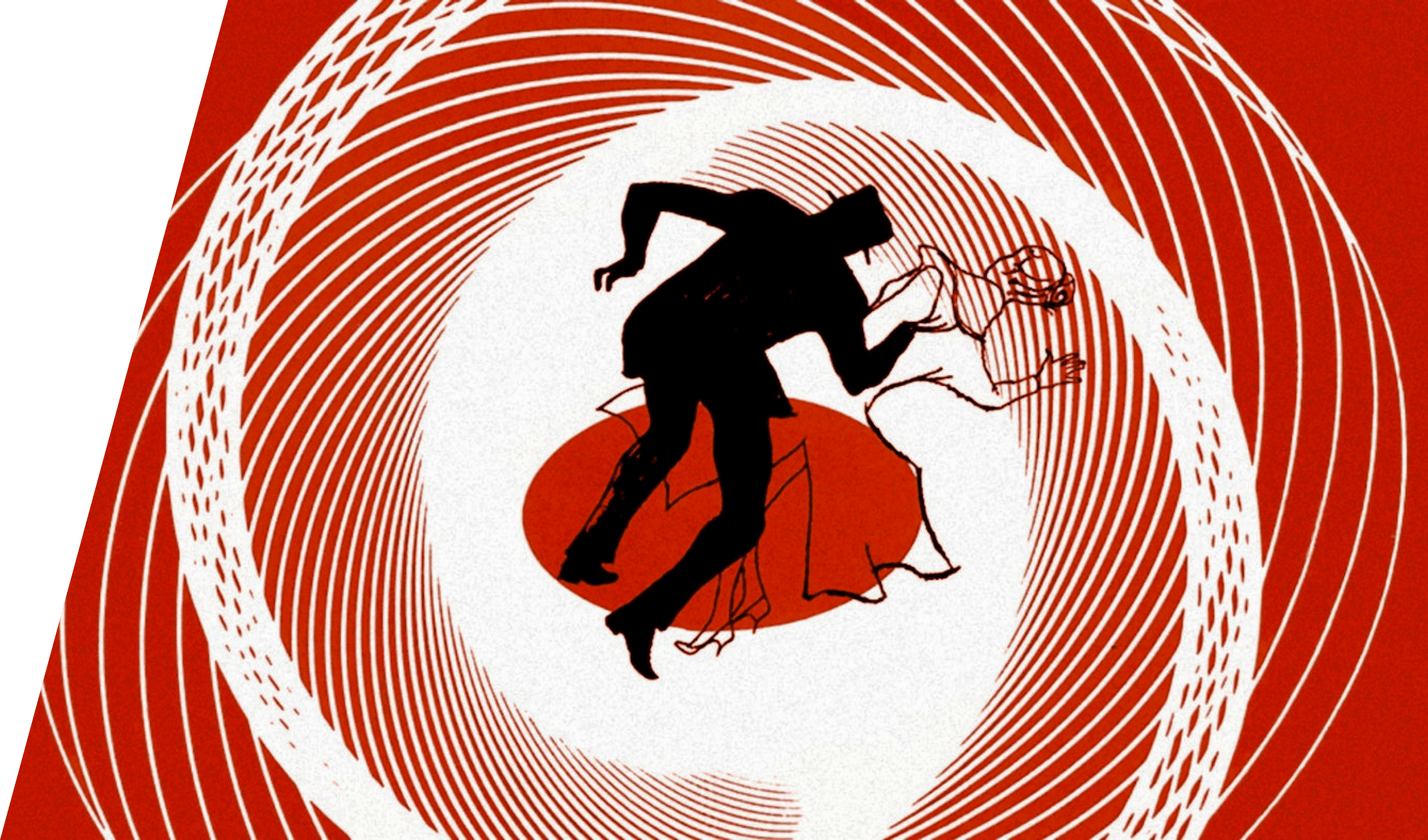
During the 20th century, a man called Saul Bass was said to have changed the way of design was done during then but how much did he really change the way of design or how it is done today and if he helped push the late modernism movement after the 50s?
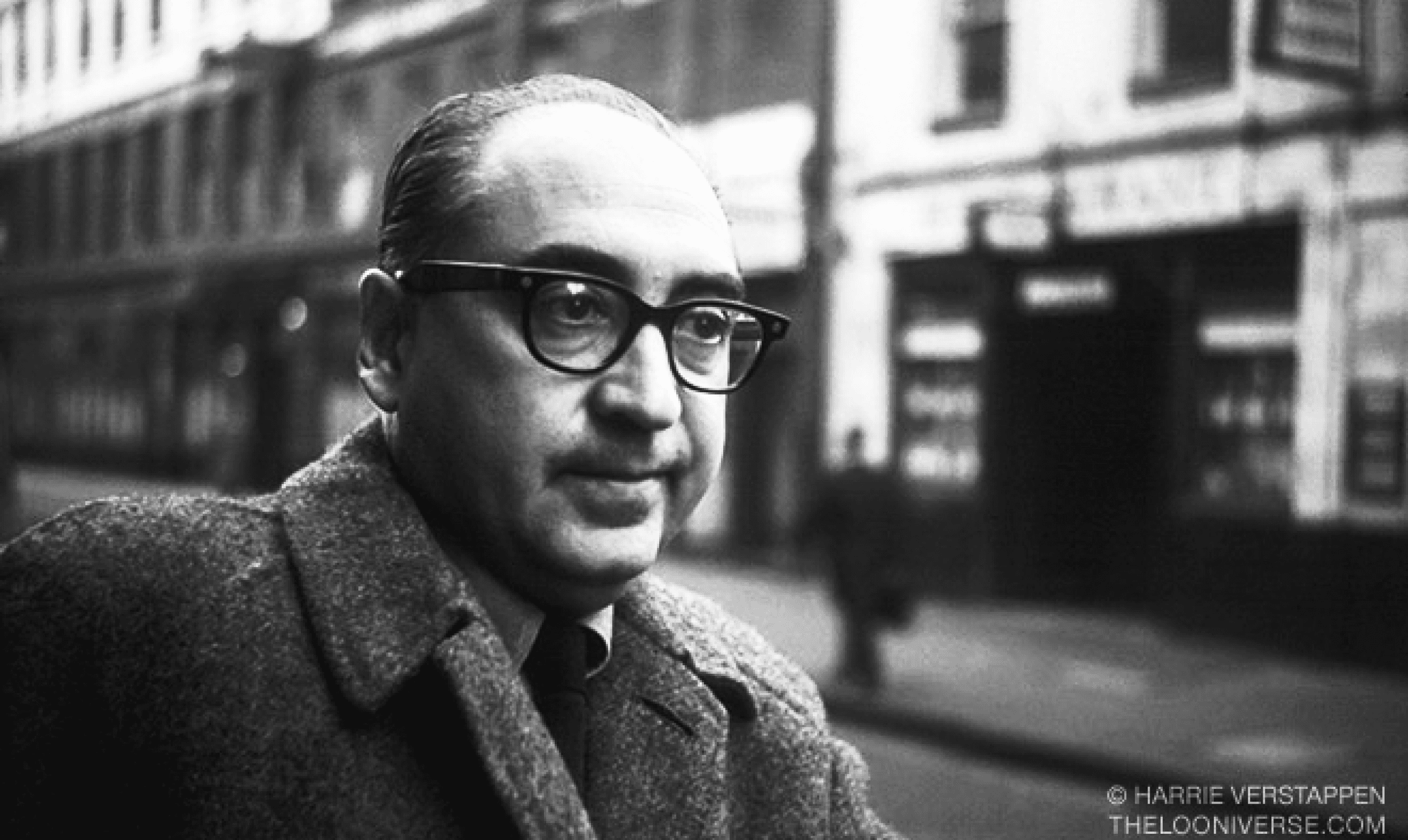
Saul was born on May 8th 1920 in New York city, he was a world famous graphic designer, known for his works in motion pictures, their titles sequences and adverting posters. Saul had worked on movies and short documentaries of his own, examples being, Why Man Creates, Phase IV and The Solar Film, just to name a few. In addition to his movie creation, Saul also done corporate logo design for various large companies around the globe. Companies such as Kleenex, AT&T and Warner Communication; some of these designs are still being used to this day.
Saul was born on May 8th 1920 in New York city, he was a world famous graphic designer, known for his works in motion pictures, their titles sequences and adverting posters. Saul had worked on movies and short documentaries of his own, examples being, Why Man Creates, Phase IV and The Solar Film, just to name a few. In addition to his movie creation, Saul also done corporate logo design for various large companies around the globe. Companies such as Kleenex, AT&T and Warner Communication; some of these designs are still being used to this day.
Saul Bass and his work
Film Posters
Continuing on from other parts of Saul’s past work. Saul during the same time was commission to design branding for large and small companies. Following his on own style of minimalism with easy legibility, when you know Saul’s style, it’s easy to spot one of his branding designs. The example here is the old AT&T logo, that was later changed in 2005. It shows a good example of how Saul design and produced his branding designs using his own style as talk before it past examples.
Branding Logos
His Work
Before Saul started on his career in designing corporate logos, he made a big break in movie industry producing and designing for all types of different films.
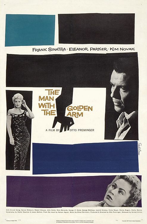
The first notable poster design that Saul designed was the poster for the movie, The Man with the Golden Arm, made in 1955, it marks the start of his overall style for his life and most of this works/design, this style being a strong and heavy of minimalism, simply and lack of detail in shape, use and choice of colours but one also parts thats are sometimes missed by people is the level of legibility and readability of them, this being how easy it is to read the text of the poster. Furthermore the readability also counts to getting what the poster means to get the viewer of it.
Title Sequences
Though Saul’s designs for movies posters was infamous within the field of design, in motion pictures during the times of the 1950s - 80s, the title sequences that he produced was just or even more infamous then them.
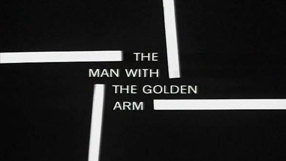
These sequences would be the first part of a film that a person would see when viewing it, Saul would use this fact to his full advantage every time for every title sequences. In each one, Saul would tell the story of the movie without giving anything way about it, crafting a very short story at for every one.
Following on from this, the most important part of these sequence was that it matched the overarching design style for the movie in question overall, the example here being The Man with the Golden Arm, as seen, the poster and the title sequence match in their design style, the shape, layout, typography and graphics are the same with some small changes for each mediums needs. Now this doesn’t sound that good or impressive for today, but all this was done during a time when computer aided design and motion graphics didn’t exist yet, so to maintaining this level of consistency with doing it by hand is a real challenge.
Saul Bass
How much really did Saul Bass change design during the 20th century?

This quote a lot of design could understand. To me, it shows off his mind set for design, his mindset that most ‘visual messages’ can be ‘clutter and ugly’ and that designer are responsible for making it better. This mindset can be seen easily in this overall design style throughout all of his posters, branding designs and title sequences.
For this short break down, one of my favourite examples of Saul Bass work is going to be using to highlight points, the film poster that is from the The Shining.
One of Saul’s biggest strengths in his designs in the heavy and smart use of minimalism and strong focus on the main aspects of the design, using the example, this would be the centre piece of typography that has an illustration drawn into the title.
Next is the overall layout of his designs, most, if not all of them will have centre focused hierarchy, this means that your eye will mostly anyways get drawn to the centre of the page, this is done in the poster using typography with different scales and weights. It goes, centre, top then bottom, this creates a better ‘flow’ for the eyes of a reader. Continuing with typography, a lot of Saul’s work is done with sans serifs font families, to adds to the overall minimalism of his designs and style of them.
Now with all these design steps and processes, this is what creates the foundation of Saul Bass’ design style. The minimalist, meaningful placement of aspect on the designs and the modern use of sans serif before it was normal to use them, this all shows that Saul’s design style and skills was ahead of it time.
So all this talk and history about Saul Bass’ artworks, design style and overall approach to his process of said designs but what really makes up his design style and does it really work?
“In the course of our daily lives, we're bombarded with a barrage of visual messages, some blatantly aggressive, some subtle. The trick is to find a way to break through without adding to the clutter and the ugliness. We have to be responsible about that.” - Saul Bass
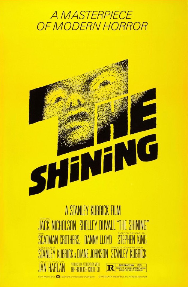
The Bass Style
During the 1990s, Saul passed on April 25th 1996. With everything he did, he for sure left a lot for legacy with some of his work being used to teach about design and how it is mean to be done in the industry but how much did his work change the whole of design?
In my opinion, Saul Bass didn’t change the whole of design himself but for sure helped with the big changes that was happening in the 20th century post WW2, this being the late modernism movement, this movement or ongoing change was a lot of designer and artists was changing from doing more classic design and find a better design style in the art of modern design styles, example like swiss design, minimalism, etc. Also a lot of changes was happening before even this, for example the Bauhaus group was making a lot minimalist pieces but this in different field of design that Saul. Breaking this down more, Saul’s biggest change for the industry was mixing unusual design methods into mainstream content, example like big companies branding, movie poster, etc. This unusual mixed of design, I feel is what Saul Bass changed within the industry for the coming future.
One of the biggest parts of his legacy that lives on is the ideas that he produced for corporate branding, the concept of making logos for companies more minimalist and legibility for all type of places it could be used, is still found today; even more than what it was before the 21st century the start of the digital age. Furthermore, the work that Saul’s produced is still talk about and is used in schools to teach about good design practises. The only parts that really haven’t stuck on are the work he did for title sequences but the idea of simplicity over complexity in them is still around in some form.
So in my view, Saul didn’t change the whole of design but he changed the way that design for commercialism is looked at, this meaning how minimalism can be put into pieces of branding materials/designs and still work.
Designs and Ideas that lives on
Markup and design: Philip Park
Images: Google